- Products
-
Design Templates
- Featured Design Galleries
- More Galleries
- Services & Resources
- Free Sample Kit
- Deals


Newsletter printing is an excellent strategy for putting your brand, products and services in front of your target audience on a regular basis. The most successful newsletters deliver outstanding value: tips, tricks, and advice your audience can use to solve their problems or enhance their lives and businesses. Print newsletters yield better response rates than email newsletters; they’re tangible publications that foster customer trust and establish your credibility – provided your newsletters feature content your customers want to read.
Newsletters mesh useful information with thoughtful design to make information easy to digest, which is why it’s important to choose good newsletter fonts (read more newsletter design tips). The best font for newsletters will draw attention to your article headlines and make your body copy easy to read. The following will help you select newsletter fonts that are easy on the eyes, so your audience will enjoy reading your newsletters.
Before you can select the best font for your newsletters, you should identify which types of fonts you’ll need. Your newsletter format should follow a style guide that dictates exactly which font (including its size and weight) should be used for each text element.
You should define which font should be used for each text element; for some, your style guide might allow two or more fonts to be used – though to maintain a consistent, cohesive design, your font styles shouldn’t contrast too much with each other. Your fonts don’t need to be ultra-creative or wacky; often, simple fonts work best for newsletters.
Big, bold newsletter headlines help draw attention to your articles. They serve as visual hooks and make it easy for your audience to choose which articles they want to read at a glance. The best font for a newsletter headline could be serif or sans serif, depending on your design (check out these newsletter design tips).
Teaser text augments your newsletter headlines with additional information that summarizes each article and increase reader interest so they’ll read your body copy. Teaser text newsletter fonts should be in a lighter weight than headline fonts.
Subheads are used to break up different sections of your newsletter body copy, especially for lengthy articles that cover several different key ideas. The best font for a newsletter subhead is typically a smaller version of your headline font.
The best fonts for newsletter body copy are easy to read in paragraph form. They’re often serif fonts, which typically enhance readability; though some sans serif fonts (often used in headlines, subheads and cutlines) can serve as effective body copy fonts.
Also known as photo captions, cutline fonts are often smaller, bolded versions of your body copy. However, you can certainly choose a different font altogether, provided it harmonizes with the rest of your newsletter fonts.
Pull quotes are used to highlight key ideas within your body copy, which can increase reader interest and make your newsletters more visually compelling. Pull quotes can be larger, often colored, versions of your body copy; or, they can be stylized versions of different fonts that work well with your other newsletter fonts.

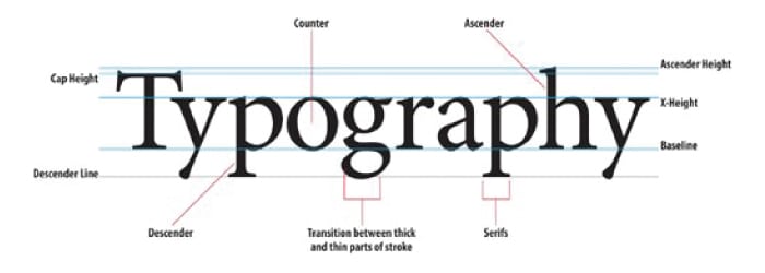
It’s easy to take fonts for granted, but once you examine them closely you’ll realize that a lot of thought and design work goes into creating good fonts for newsletters. Multiple font elements work together to deliver unique, nuanced visuals that differentiate one font from another.
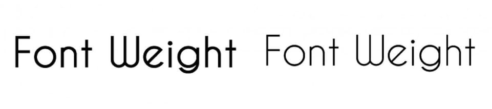
Newsletter font weight also plays a key role in design, and can inform how and where you will use a given font.
You want to choose a set of newsletter fonts that both conform to sound design conventions and lend themselves to your branding. Before you settle on a font weight or style for your newsletter, make sure it satisfies the following requirements.
Good fonts for newsletters work well with your existing brand assets
If you’re in a conservative industry, your newsletter fonts should likewise be conservative; if you’re in a cutting-edge field, you might be able to take some more creative liberties with your font selection – provided your newsletter fonts are easy to read
Uniqueness is great for branding, but when it comes to print newsletters readability is priority one. Choose fonts that won’t strain the eye
In addition, your newsletter fonts should work well with one another. Limit your font usage to two or three fonts; if you need more, consider different styles, sizes, colors, and weights of the same font instead of trying to force completely different fonts into your newsletter design. You can use a service such as Font Pair to identify complementary fonts that will make your newsletter pop.

It might seem like a lot to consider, but choosing the best newsletter font doesn’t need to be difficult. One excellent strategy is to make a list of fonts you like, then justify their use in your newsletter according to the tips listed here.
You can use the following newsletter font examples in your own newsletters; or, use these suggestions as springboards for inspiration. You can find similar, yet unique, fonts by using a free service such as Identifont .
Newsletter headline and sub-head fonts
These big, bold newsletter fonts lend themselves to headlines and subheads.


The following fonts work well as teaser text, placed immediately below your newsletter headlines.


These fonts make for great newsletter body copy; though they can also be used as headlines.


Font selection plays a key role in newsletter perception, which makes it critical to your newsletter marketing strategy. Ready to engage your audience with compelling newsletters that feature attention-getting, easy-to-read fonts that enhance your message? Do it for less with premium newsletter printing at discount prices.