- Products
-
Design Templates
- Featured Design Galleries
- More Galleries
- Services & Resources
- Free Sample Kit
- Deals
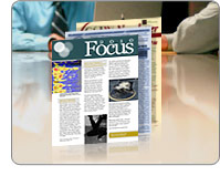
Newsletters are a great way for businesses to keep in contact with customers so they can tell them about the latest news, trends, products and services that might be of interest. They build confidence in your company by demonstrating you're always working hard for them. Most importantly, they drive sales. The content of a newsletter is extremely important when it comes to affecting a sale; however, the design of a newsletter can be just as important, especially when it comes to your company image and the power of persuasion. Here are a few newsletter design tips you should follow when designing newsletters:
This might sound simple enough, but you'd be surprised how many elements can be missing from newsletters. Whether they realize it or not, readers are used to certain elements that help guide them through the newsletter in an inverted pyramid - the most important information should be the most prominently displayed information. These include:
 Nameplate- The nameplate is your best branding opportunity, because it should be the biggest element on your newsletter. It contains the newsletter name and date/volume, as well as any logos or taglines the company has.
Newsletters are good places to showcase company staff and customers. Try adding a photo collage to your newsletter design as long as you don't go overboard - too many photos will weaken the content. Other than a collage, one or two photos per page are plenty. Mug shots are often used in newsletters, and, unfortunately, they all tend to look the same after awhile; dull and bland. Try spicing up mug shots by including action shots instead of still shots.
 Use big headlines that grab attention fast and add large page elements such as drop caps and pull quotes (extra large text often wrapped by the main content that accentuates a key quote) to keep the flow quick, smooth and interesting. Headlines should be written in a consistent sans serif font, and you should ensure that all headlines, drop caps and pull quotes are the same color as their corresponding element. That doesn't mean that all of your big elements should be the same color; only that all headlines should be the same color, all drop caps should be the same color, all pull quotes should be the same color, etc. By doing so readers can quickly tell what the purpose of each element is and take it into proper context.
Pull quotes aren't the only thing you can use to draw attention to a specific important thought, idea or product. Try adding colored boxes or sidebars highlighting the most useful or interesting aspects of the newsletter. Alternatively, the sidebar could act as a calendar of events for groups, clubs and other organizations that meet regularly; while a horizontal area at the bottom of the page could be a graph highlighting recent stock growth or other data as in an investor newsletter.
You don't want your newsletter to be too bland or too colorful. It needs to be just the right mix to be pleasing enough to the eye for customers to read it. Don't color your main body text a fancy color - stick with black because it has the highest contrast with white paper (don't use any other color paper for the same reason). Make sure you leave plenty of white space around page elements so the newsletter is easy to read and follow.
End signs, which are small symbols at the end of each newsletter article, don't have to be boorish bulleted points. Try coming up with a relevant shape that fits will with the newsletter them; or you can even try a company logo to further your branding efforts. You could also try designing postcard newsletters, which are basically newsletters printed front and back with an article, image and sidebar on each side. They're different from the competition and economical to print and send, though they do stray from the commonly accepted newsletter format. The newsletter is a mix of conformity and creativity. Make sure yours conform to the accepted standards, add a touch of creativity, and you'll be on your way to designing a compelling newsletter that aids in the quest for return on investment.
Success! You're all signed up.