- Products
-
Design Templates
- Featured Design Galleries
- More Galleries
- Services & Resources
- Free Sample Kit
- Deals

Business card font choice is an oft-overlooked design element that can have a major impact on how you, your brand, and your company are perceived. Powerful business card fonts command attention, differentiate you from the competition, and help you stick in prospects’ memories – all critical components to earning follow-up responses. The following will help you choose the best business card fonts to help you get noticed.

The best business card font isn’t the same for every company. You should select a business card font that represents your brand image and resonates with your audience. Choosing the right font for your business card requires a strategic approach, a bit of creativity, and perhaps even some intuition.
A lot of companies stick to traditional business card fonts such as Arial, Helvetica, and Times New Roman. These are good standard fonts because they’re easy to read, but they’re so ubiquitous., doing little to make your brand stand out or differentiate you from competitors. You can choose different fonts that are still highly readable, yet set your brand apart.
Good fonts for business cards suggest what type of brand you are and stir a customer’s emotion: joy, excitement, thoughtfulness and trust. The best font for your business card will depend on what your brand wants to convey.
For example, a construction company might choose a strong, bold, heavy font that suggests strength and stability – the same features their buildings offer. An art gallery, on the other hand, might opt for a light, thin, elegant font that suggests artistic creativity.
Keep in mind that, like letterhead fonts, your business card fonts are central to branding, unlike the fonts you might choose for your brochures and flyers (which might be event-specific), print newsletter fonts (which read like newspapers), or fonts for mail-order catalogs and direct-mail postcard fonts – all of which might change based on the content and context of your marketing materials. Business card fonts are part of your identity.
A good font for business cards should stray from the norm. Instead of the traditional, standard fonts you’ll find one everyone else’s business cards, seek a creative font for your business card that is decidedly different.
Of course, this doesn’t mean you should print business cards with wing dings. The best fonts for business cards are easy to read. The last thing you want is for prospects to squint or struggle to decipher what your business cards say – a perfect way to find your business cards in the trash.
Experiment with fonts for business cards that are subtly, yet distinctly, different from traditional fonts such as Arial, Helvetica, and Times New Roman. Compared to those standard fonts, a good font or business cards might be bolder, thicker, taller, thinner, shorter, or slanted.
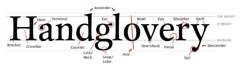
Pay attention to how font character elements can symbolize your brand, in addition to typography tools such as kerning and leading. These can help inform which is the best font for your business cards.
Often, a single business card will feature multiple fonts. Different fonts might be used for:
It’s best to stick to two or three fonts total, but no matter how many fonts you use they need to work in harmony. Fonts that are dramatically different can be distracting and lose the sense of cohesiveness you want your business card design to feature.
Font Pair and Typ.io are two sites that help you identify good business card font pairs. In some cases, you might use a single font and vary its weight for different business card content.
It’s important that any font combination you use works together, as poor typography is one of the top five business card blunders. The good news is it’s easy to avoid when you follow the tips we’ve outlined here.
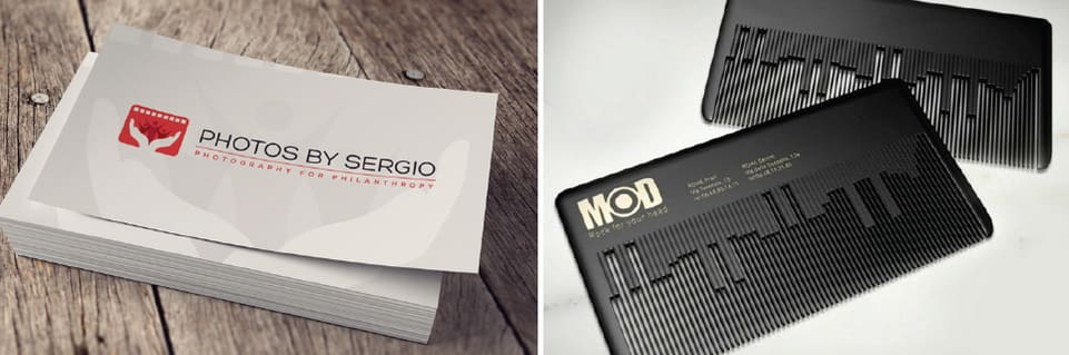
Your fonts should also work with your business card printing options. A sci-fi font might work well with glossy ultra business cards, while a light, elegant font might works best with velvet, matte or uncoated business cards.

The best font for your business card will depend on the aforementioned factors; for your inspiration, the following lists some of the best fonts for business cards according to style, collected from TypeKit. If you struggle to find the perfect font, you can also consider creating a custom font for your business cards.
Vinyl
Brandon Grotesque
Foco


JAF Bernino Sans Condensed
Prenton Ultra Condensed
Franklin Gothic URW Extra Compressed


Omnes Pro
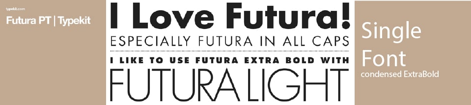
Futura PT
Learning Curve


Futura PT (heavy)
LFT Etica Display
Ratio


Brioso Pro
Abril Display
Garamond Premiere Pro


Nasalization
Tachyon
Automate


FF Cocon Pro
Omnes Pro
Salsbury


Proxima Nova
Museo Sans
Museo Slab
JAF Facit
Raleway


Ready to make a statement with powerful business card fonts? Do it for less with premium business card printing at discount prices